'You do your best, but the tools make it harder than it needs to be'
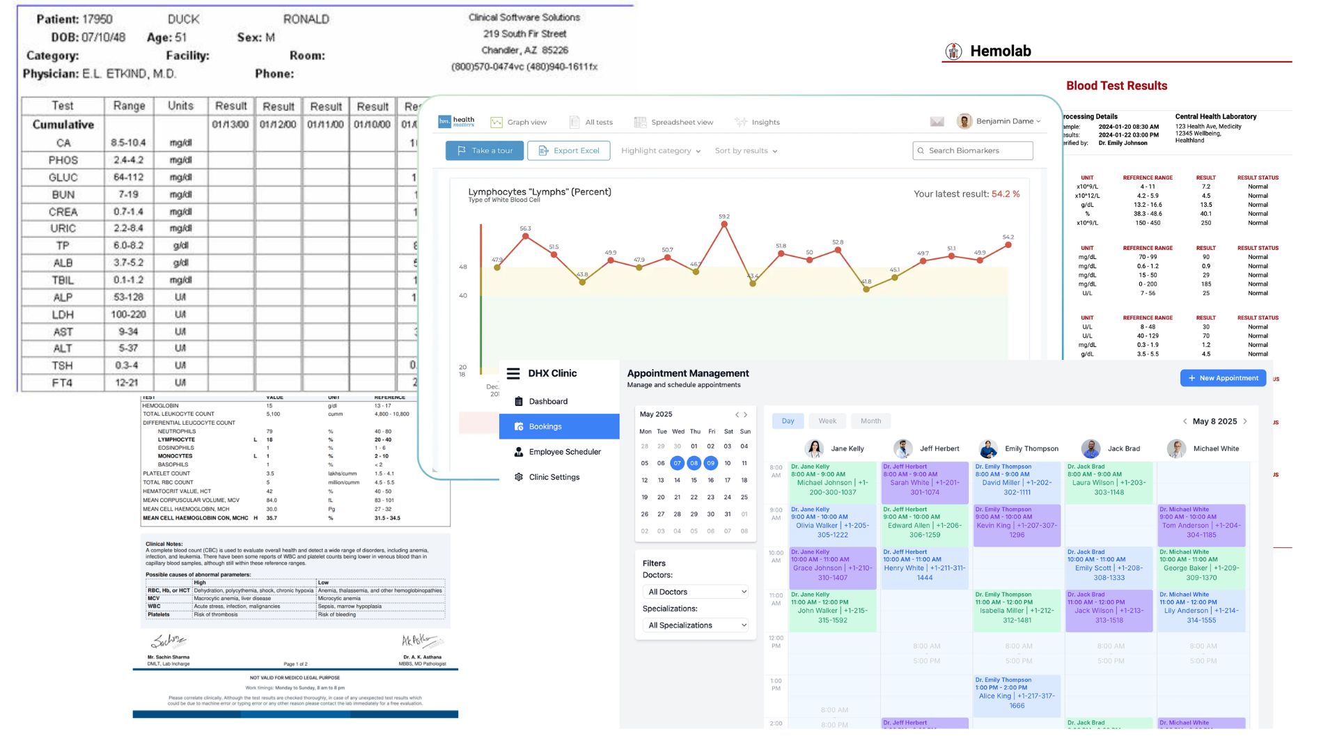
Specialist physicians in Australia start every consultation the same way - not reviewing the patient, but hunting for their information. Telemetry on one screen, labs in another portal, imaging in a third system, nursing notes in a disconnected folder. The data exists. It's just never in one place.
My Role
MediPulse was developed as a group project during my Master's at UQ. My individual contribution centred on information architecture and wireframe design - translating research findings into the structural and interaction logic of the product.
Platform
Web · Mobile Web
Tools
Figma, Hotjar, FullStory, Optimal Workshop
01 - Project Overview
A hospital with a fragmentation problem hiding a patient safety problem.
“I had three other patients, two systems that wouldn't load, and a stack of paper lab results from the morning. You do your best, but the tools make it harder than it needs to be.”
This observation from a cardiologist became our lens for MediPulse. It wasn't a complaint about technology - it was a quiet acknowledgement that the systems meant to support clinical care were failing the people who depend on them most.
Project constraints
Australia's Privacy Act, My Health Records Act and thirteen Australian Privacy Principles meant every data and access decision carried legal weight. Cardiac telemetry exists in Australian wards but has never been integrated with labs, imaging and clinical notes in one view. And unlike most software, the margin for error here is zero - poor UX doesn't cause frustration, it causes harm.
" The technology was never the gap. The telemetry worked. The labs existed. What was missing was a single view that brought them together - precise enough to be trusted, fast enough to be used."
02 - Market Research
Competitive Analysis: Learning from Existing Clinical Tools
We audited Epic Hyperspace and Cerner PowerChart, walking through real cardiologist workflows - pulling up vitals, reviewing labs, responding to alerts.
84.2%
of physicians rate their EHR below 68 on the System Usability Scale - the industry average.
3%
Each 1-point SUS improvement correlates with 3% lower odds of physician burnout. (Melnick et al.)
Watching clinicians work
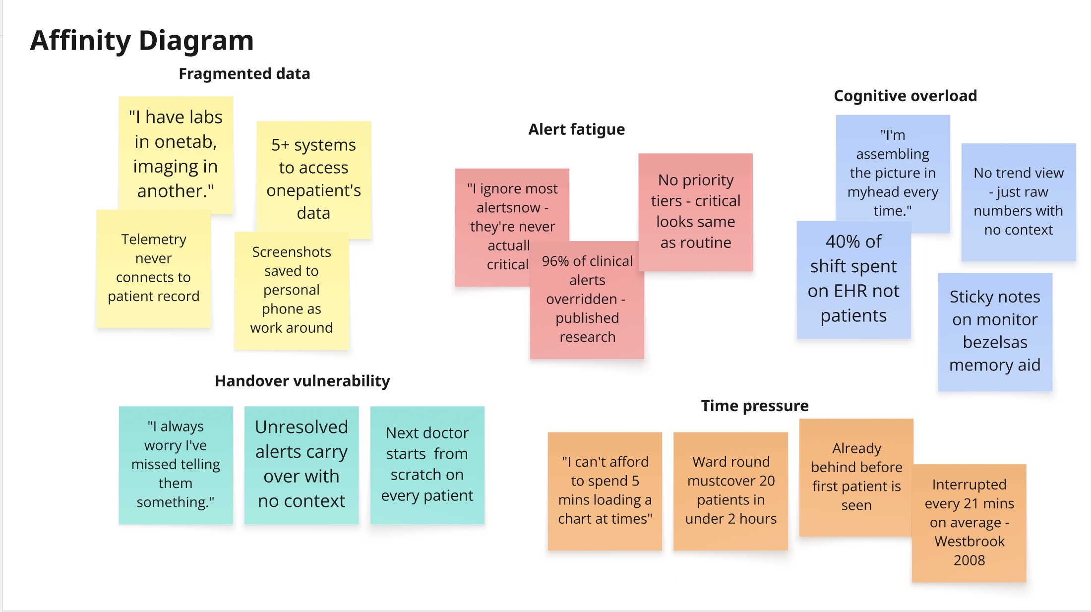
We observed specialist physicians during ward rounds rather than relying only on interviews - what clinicians say they do and what they actually do are rarely the same thing. Doctors had built informal workarounds: screenshots saved to personal phones, sticky notes with patient codes, paper printouts because the system "loaded too slowly." These workarounds were the real interface. MediPulse had to be faster and simpler than a Post-it note to earn a place in the workflow.
SME Interviews: Understanding the Clinical Mental Model
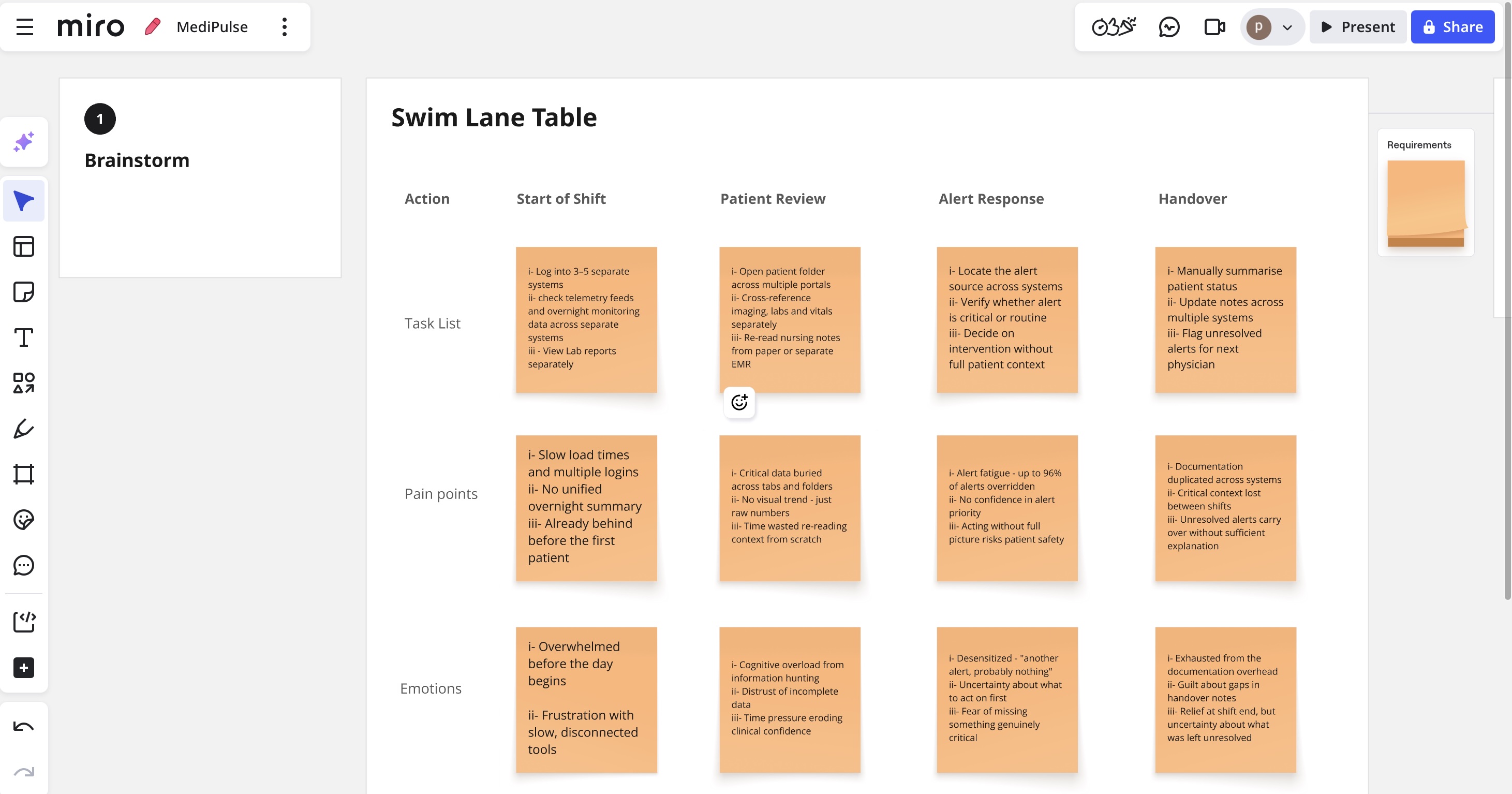
We interviewed five specialist physicians across cardiology and general medicine, focusing on how they prioritise patient information under time pressure - and what separates a "good morning" from a "bad morning" before they've even seen their first patient.
03 - User Research
Research method: Contextual Inquiry
Rather than pulling clinicians into a meeting room, the team observed them where the real work happens - the ward, the nursing station, the handover room. Clinical behaviour under pressure is fundamentally different from what clinicians describe when relaxed and reflective. The workarounds only reveal themselves when you're watching. Sessions ran with 5 specialist physicians, 5 nurses and 4 admin staff across two cardiology wards, 45–90 minutes each, during active shifts.
Three Critical Discoveries
1
Cardiologists don't think in folders or tabs - they think in patient urgency.
2
Alert fatigue was worse than the literature suggested.
3
The handover moment was the single most vulnerable point in the entire patient journey.
04 - Affinity Diagrams
Synthesising conversations into clear direction
05 - Design Strategy
From research to design - three discoveries, three decisions
Each critical discovery from research had a direct consequence on how MediPulse was designed. Nothing was added for aesthetics; every decision traces back to something we observed in the ward.
Discovery 1
Cardiologists don't think in folders or tabs - they think in patient urgency.
→
Design Response
Urgency-first IA - the dashboard leads with patient status, not navigation menus. Progressive disclosure shows a ward-round summary by default; full detail only on demand.
Discovery 2
Alert fatigue was worse than the literature suggested.
→
Design Response
Alerts use colour + icon + label together - never colour alone. Pre-attentive encoding throughout: status readable in under 200ms, no reading required.
Discovery 3
The handover moment was the single most vulnerable point in the entire patient journey.
→
Design Response
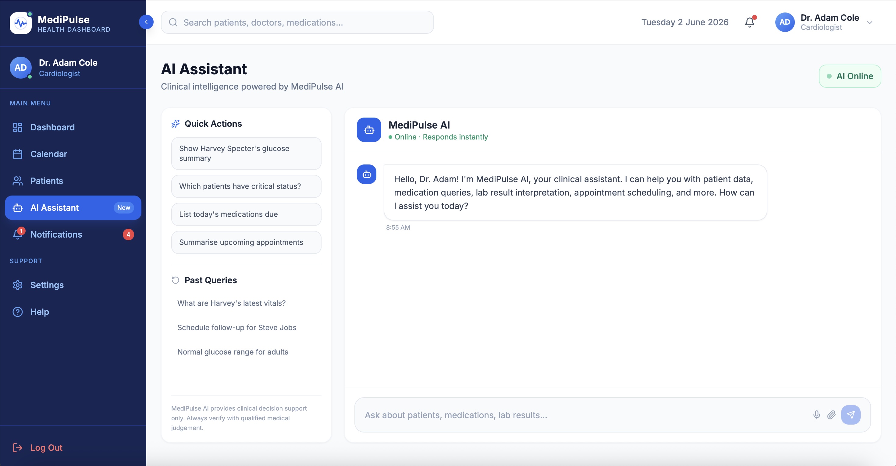
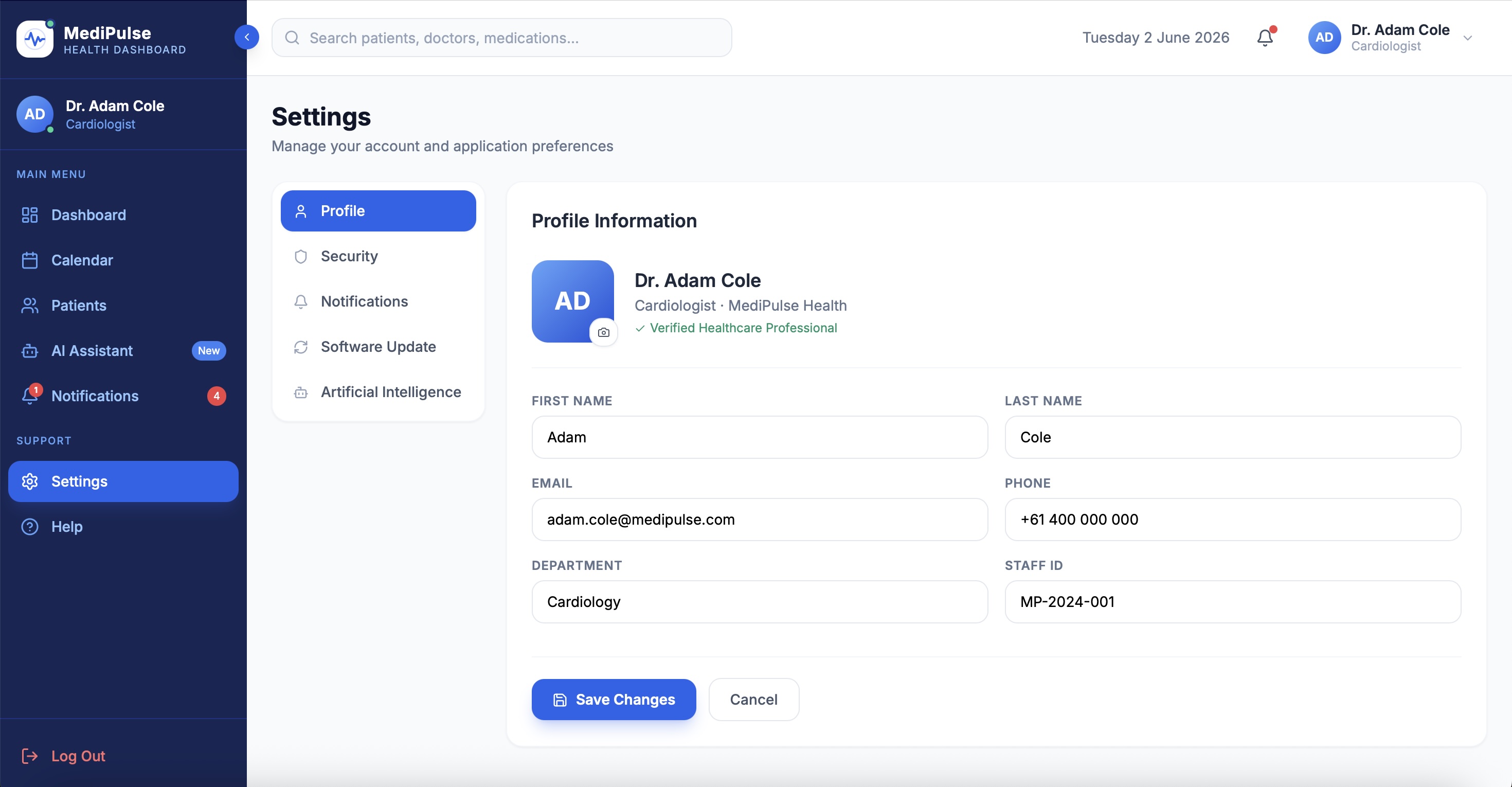
Role-aware views surface the right information for each clinician at handover. AI retrieval must cite its source - every data point is traceable, no autonomous clinical decisions.
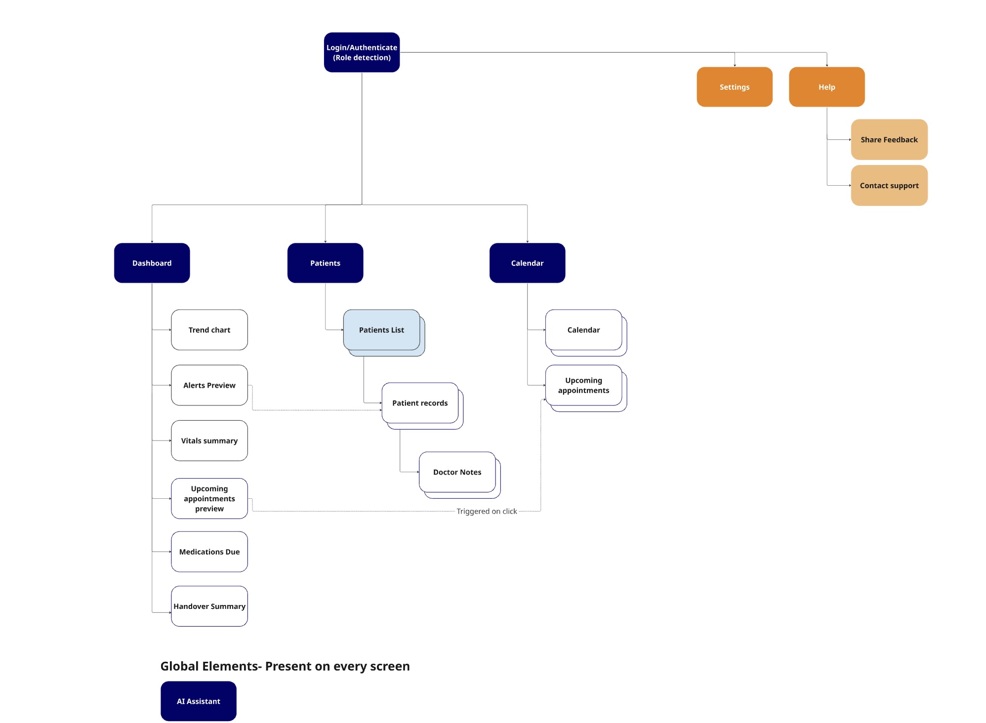
06 - Information Architecture
Mapping the urgency-first structure
07 - Wireframes & Prototypes
From structure to interaction
08 - Usability Testing
Testing with the people who will actually use it
5Consultant Cardiologists
2Registrars
2Rounds of Testing
Tested via interactive Figma prototype
Tasks given to participants
01
Find the most critical alert across your patient panel.
02
Locate the last three blood pressure readings for Patient 4.
03
Navigate from the dashboard to a patient's imaging tab.
04
Initiate a handover summary at end of shift.
05
Ask the AI chatbot a clinical question.
SUS Score
61→79
Below average to above average in one design cycle
Task Success
72%→91%
Across all five tested scenarios
Time to Critical Alert
38s→9s
76% reduction in response time
09 - Key Design Decisions
Every decision earned through research
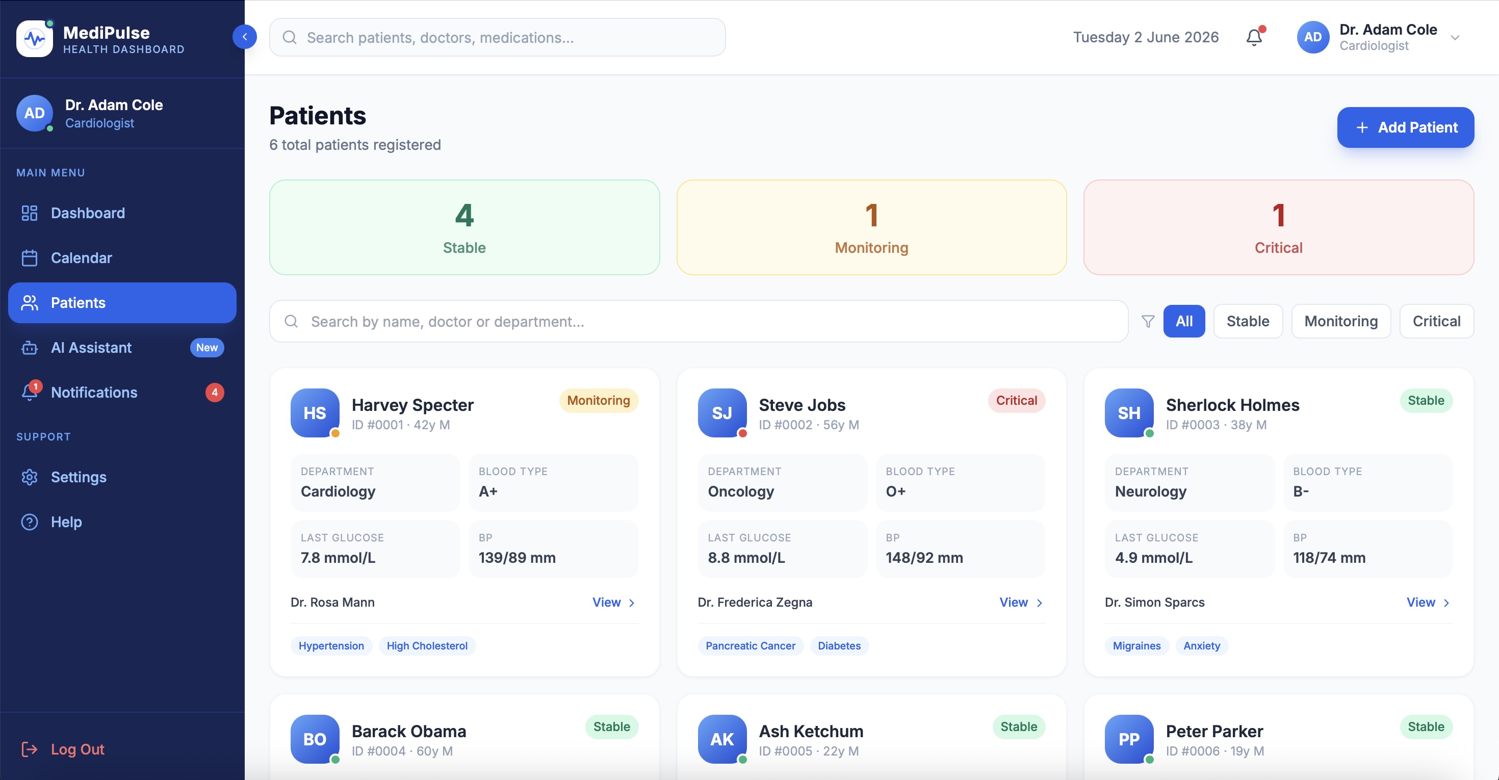
-Urgency-ranked queue with ward-location toggle. Testing revealed cardiologists think in urgency during review but in geography during rounds. One view couldn't serve both. A toggle was the only honest solution.
-Status strip on patient cards. Participants needed sub-second status recognition. A colour-coded left-edge strip communicates critical/advisory/stable before a single number is read, using colour + position - never colour alone.
-Three-tier alert hierarchy. Research shows 49–96% of clinical alerts are ignored. Reducing volume and increasing precision was the only way to rebuild trust. Critical alerts interrupt. Advisory alerts sit quietly in the nav rail. Passive alerts become a log.
10 - UI Screens
The final interface
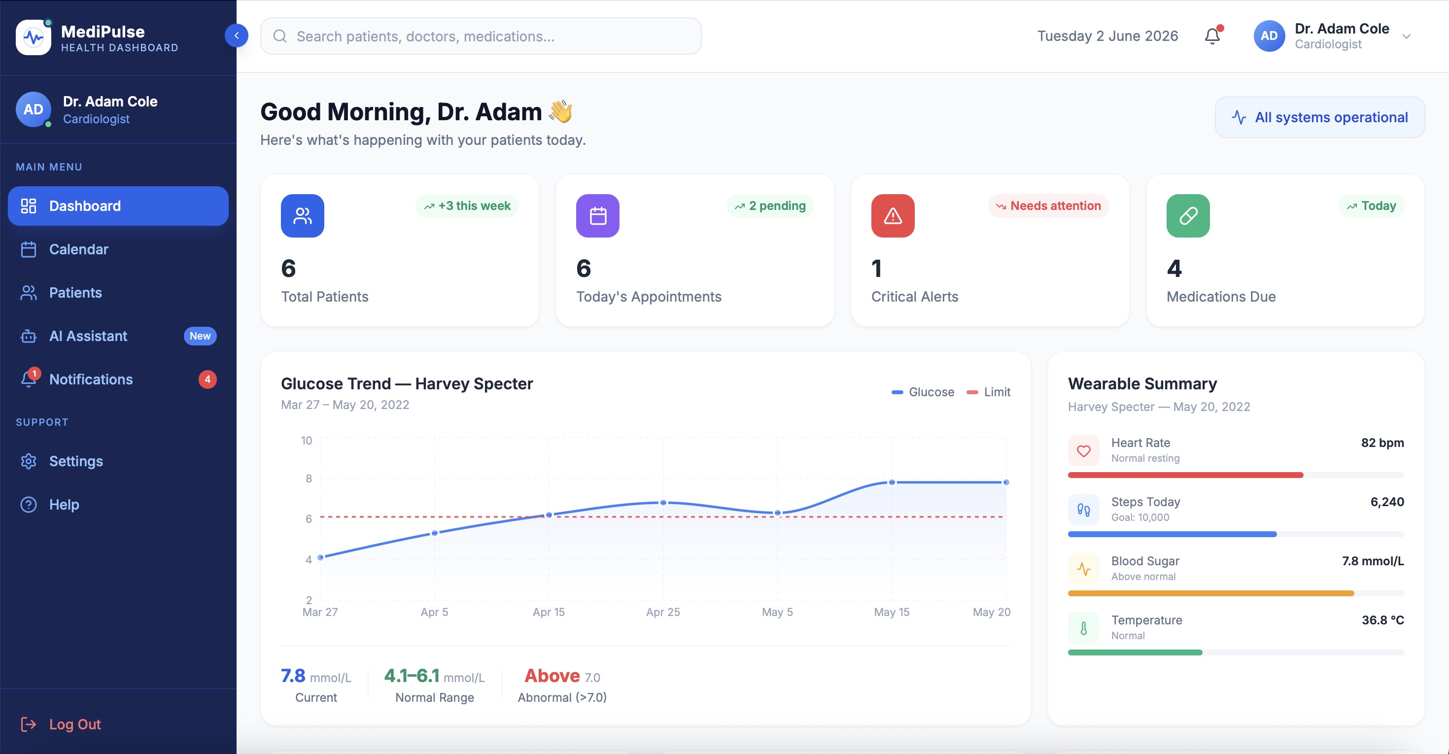
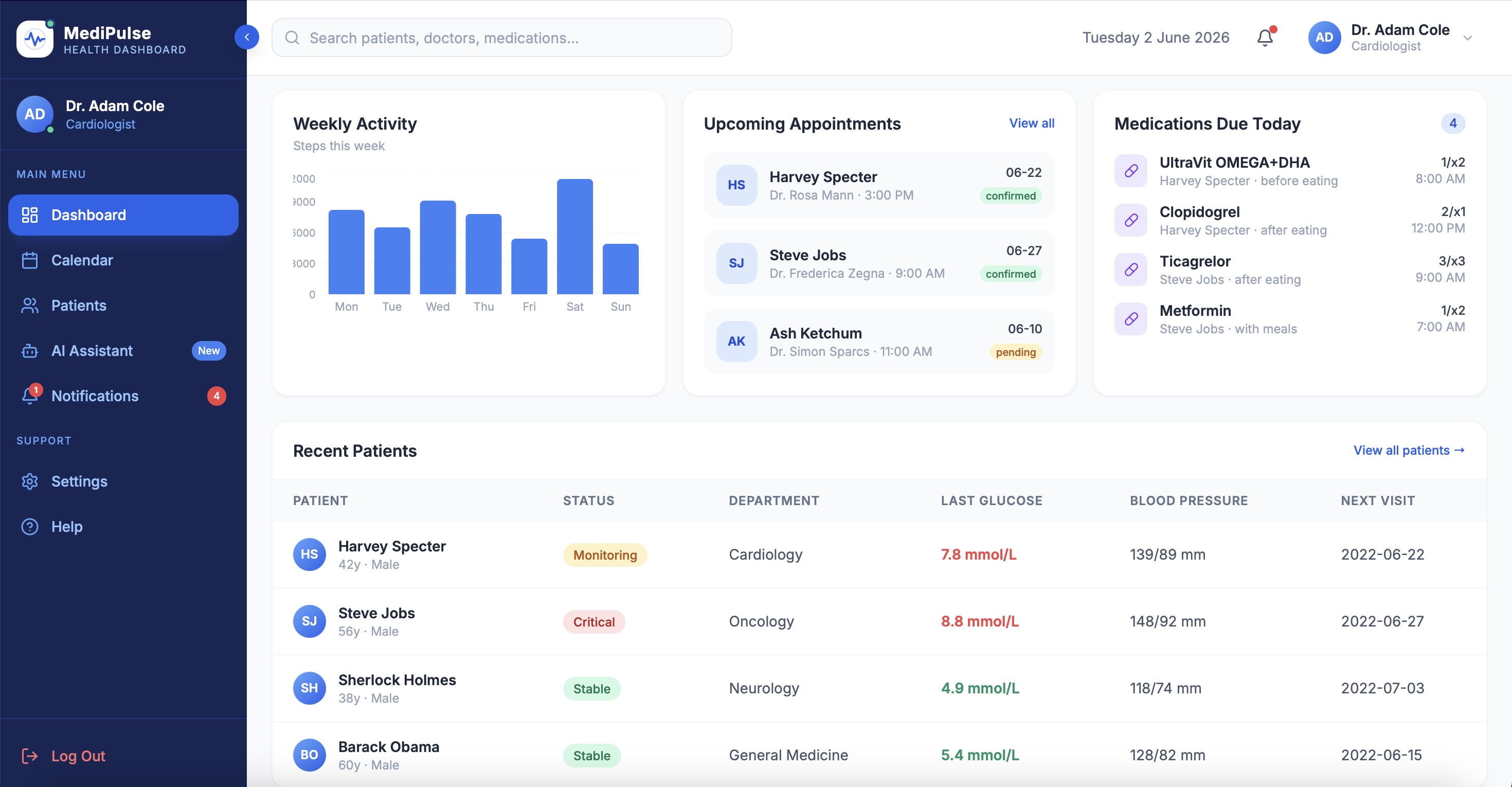
Dashboard · Patient overview
Dashboard Detail · Telemetry & wearables
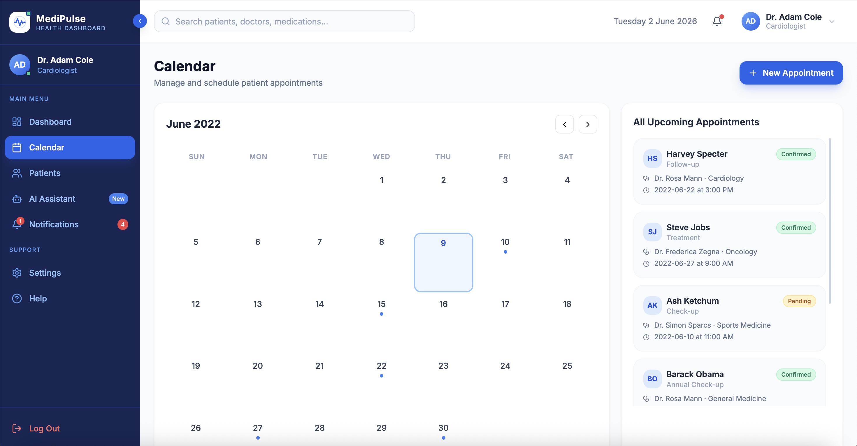
Calendar · Shift scheduling
AI Assistant · Source-cited answers
Patients · Urgency-ranked queue
Settings · Role access & preferences
Lessons Learned
What I carry forward
Lesson 01
Urgency-first needed a filter, not a fixed order.
Clinicians use the same dashboard in three different contexts - severity review, ward rounds, overnight cover. A sort filter served all three. The principle was right. The implementation was too rigid.
Lesson 02
The real insights were never spoken.
Cardiologists don't complain about broken systems. They adapt to them - screenshots on phones, sticky notes on monitors, paper lists in coat pockets. Contextual inquiry found what interviews never would. Design for the workaround, not the stated need.