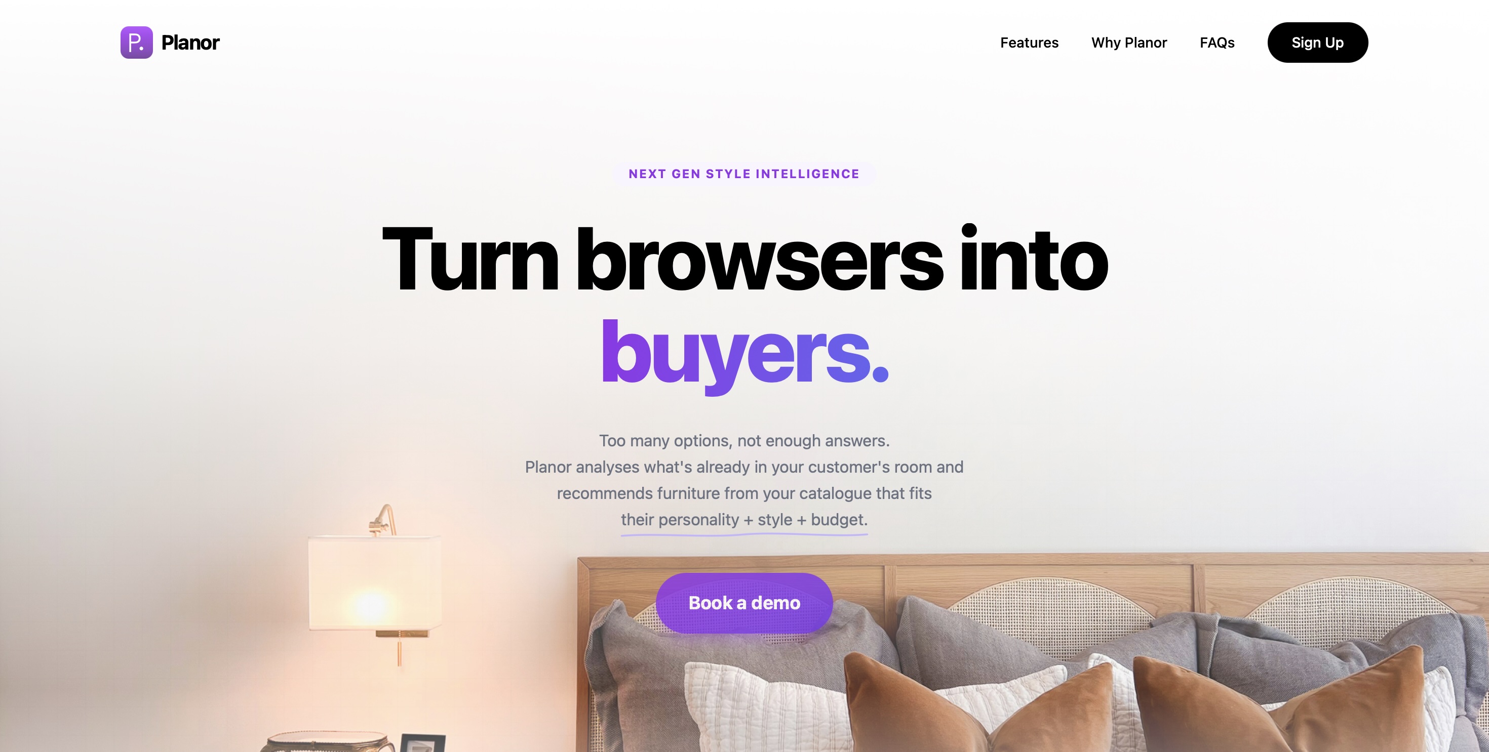
The market gap in one line
Over 80% of furniture shoppers abandon their cart. Not because of price - because of uncertainty.
Existing visualisation tools work post-selection. They show how a piece looks in your room after you've already chosen it. Planor solves the harder problem - pre-selection. What should I even be looking at?
Planor is a white-label tool embedded inside furniture retailers' websites. It reads the customer's room, learns their personality, lifestyle and budget, then recommends products from the retailer's own catalogue that genuinely belong in that space. The retailer's brand stays front and centre. Planor is invisible infrastructure.
Build a flow that works for real-world complexity
12 furniture shoppers · recently purchased or browsed online · concept validation interviews
The consistent pattern wasn't price hesitation. It was confidence failure.
Two non-negotiable principles emerged directly from these conversations:
Room analysis before any recommendations - never the other way around.
Style selection must be visual - shoppers who couldn't name their aesthetic could always recognise it.
User Flow
Entry
Retailer website
Planor embedded. Retailer brand visible throughout.
Onboarding survey
Budget · lifestyle · personality · 3 steps
Style as photography, not labels
Room upload + AI analysis
Detects existing furniture · reads room style · matches to survey
Personalised from result one
Furniture actions
Adjust budget · remove or replace items · add new pieces
Remove furniture or remove all
Add furniture
Live canvas
Place matched products into room photo · adjust · price visible throughout
UI screens
Step 01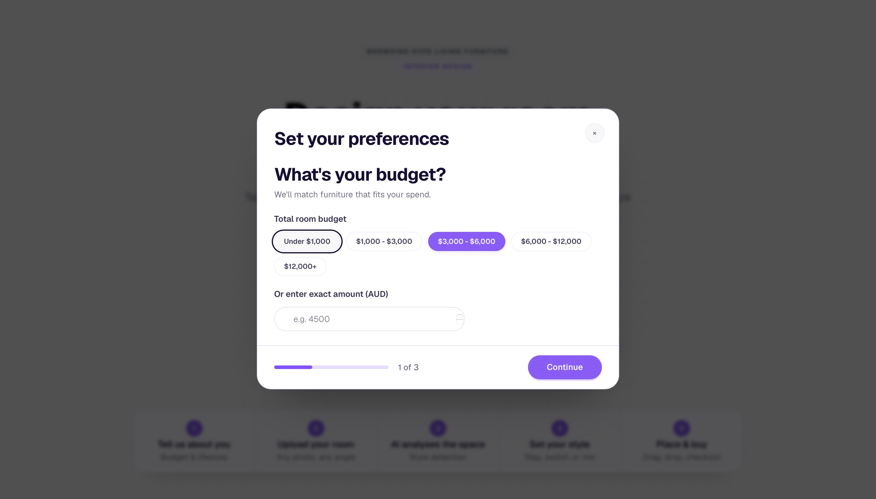
The onboarding survey opens as a modal overlay on the retailer's existing page - three steps: budget, lifestyle, personality. Appearing before the room upload, it ensures every recommendation that follows is personalised from the first result. Budget is set here and tracked visibly throughout the entire canvas experience.
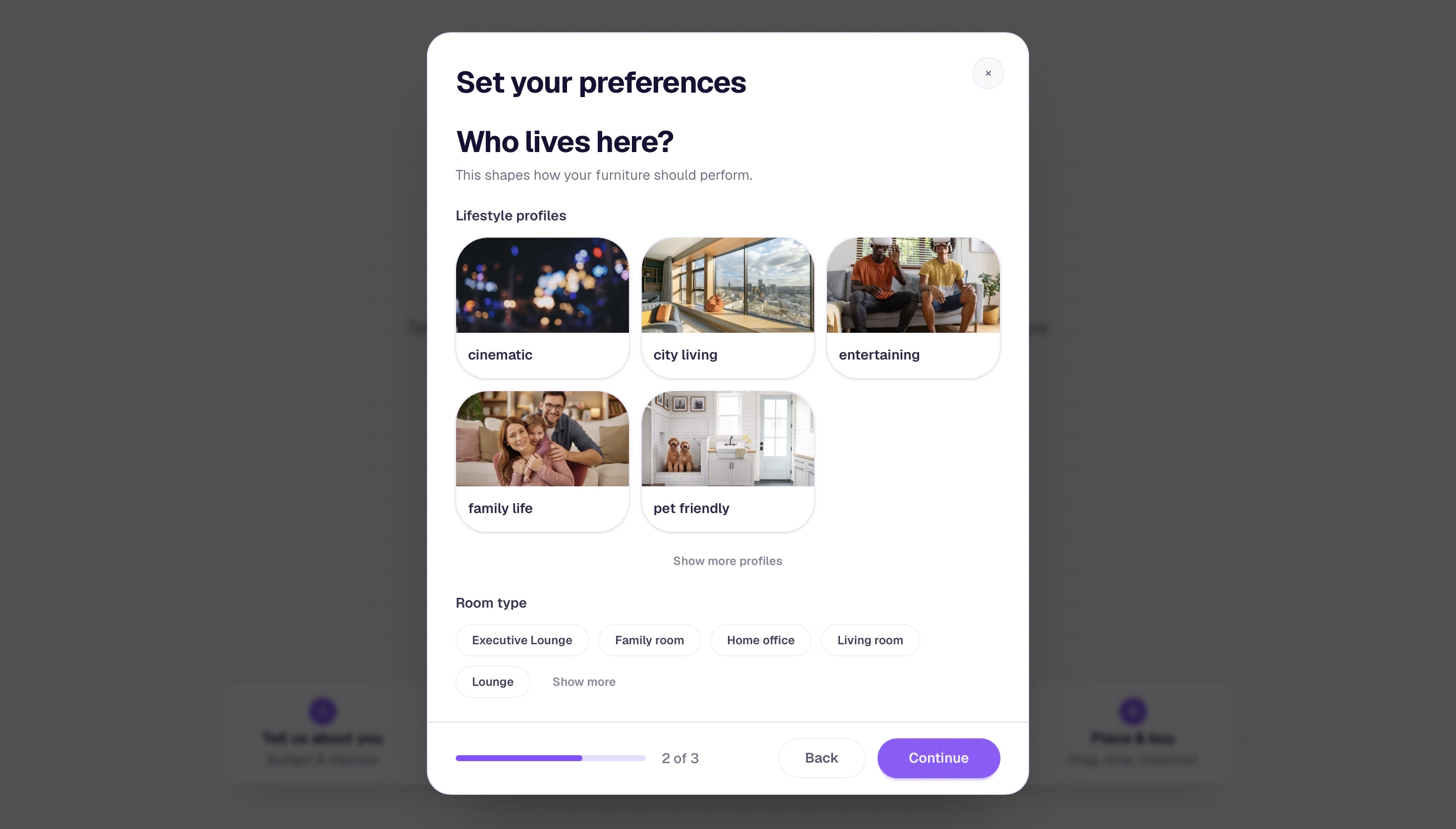
Lifestyle profiles replace generic checkbox lists. Real photography - cinematic, city living, entertaining, family life, pet friendly - lets shoppers self-identify without needing to interpret category labels. This decision came directly from research: shoppers who could not name their style could always recognise it.
Step 02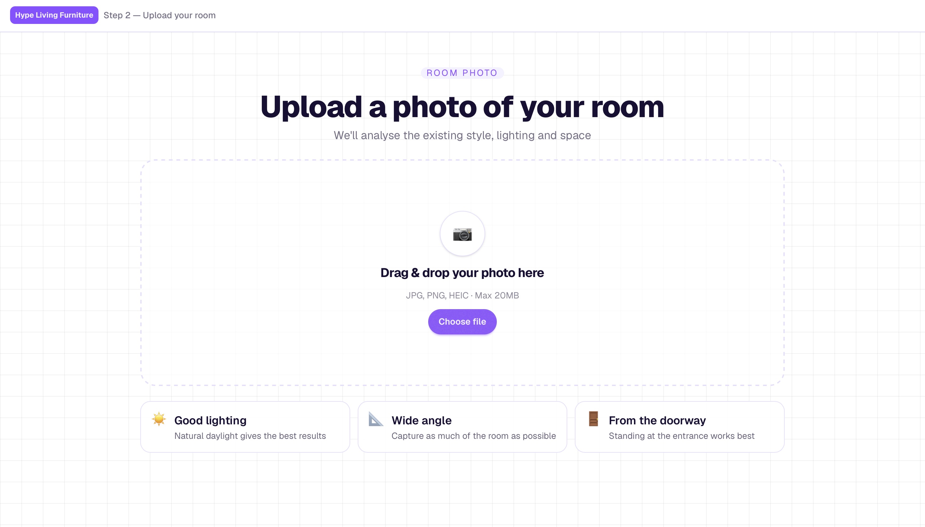
The room upload screen. Three photo tips - good lighting, wide angle, from the doorway - are surfaced contextually rather than hidden in a help section. The upload happens at step 2, after the survey, so the analysis that follows is enriched by what the system already knows about the person.
The analysis screen. A purple scanning bar moves across the uploaded room photo while the system detects the dominant interior style, existing furniture, lighting, and spatial characteristics. This moment was designed to feel like the tool is genuinely reading the room - not simply processing a file.
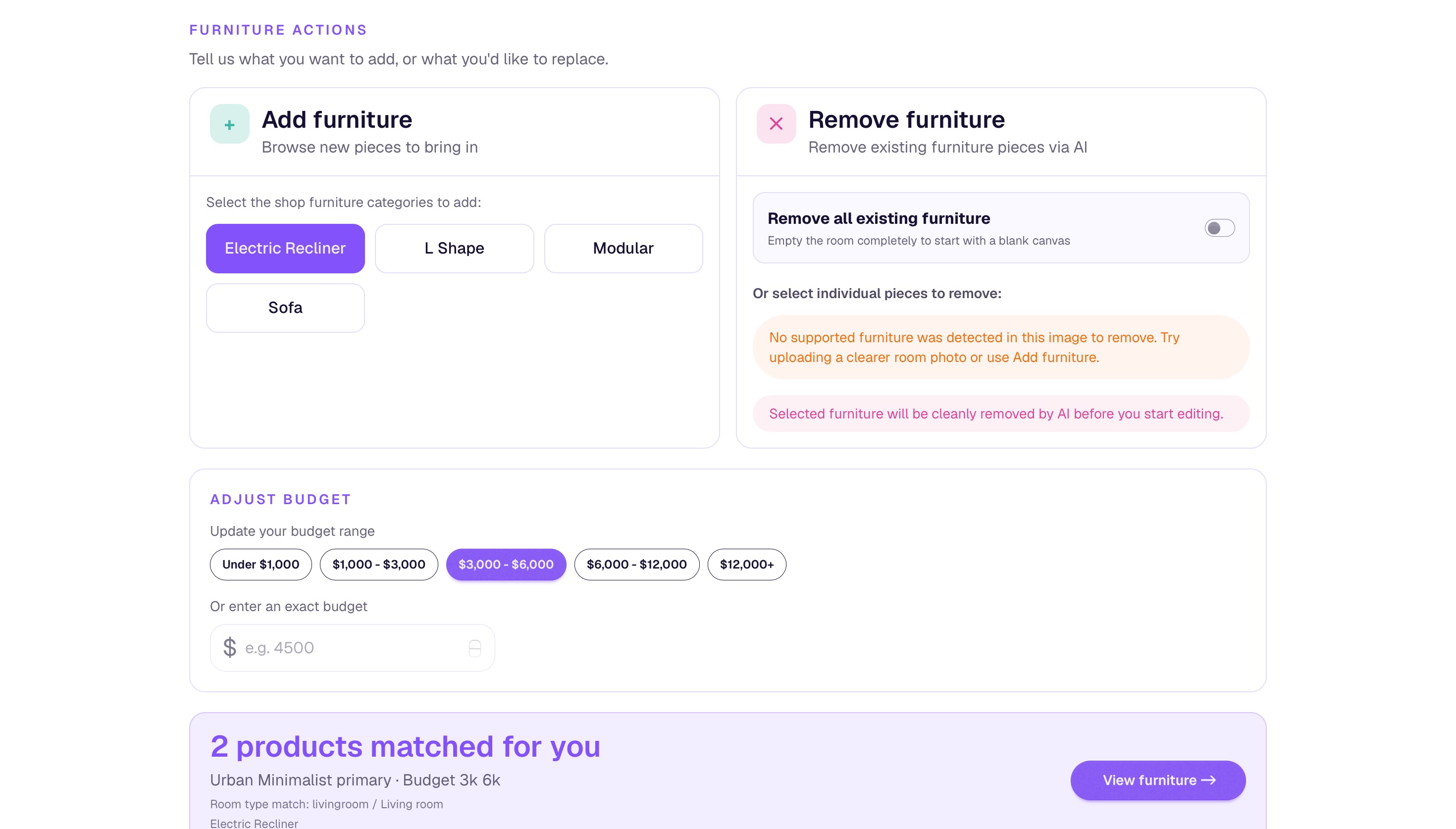
The furniture actions screen - the most iterated part of the entire flow.
The furniture actions screen was the most iterated part of the entire flow. Early versions offered two states: replace everything or keep everything. Research made clear that real shoppers live in between - they want to keep most of what they have and swap one or two specific pieces, sometimes in a completely different style.
The final design splits this into two explicit panels: Add furniture, where shoppers browse new categories to bring in, and Remove furniture, where existing pieces detected by the AI can be cleanly removed before the canvas opens. A budget adjustment module sits below both panels, allowing spend to be recalibrated mid-flow without going back to the beginning. The matched products count updates in real time at the bottom of the screen.
Step 04The room editor - the primary workspace. Matched products appear in a panel on the left with real product photography and prices. The shopper drags models directly into their room photo and positions them spatially. Export Image and Checkout Room sit persistently in the top bar - the end action is always visible, never buried. The retailer's brand tag appears top left throughout; Planor does not appear at all.
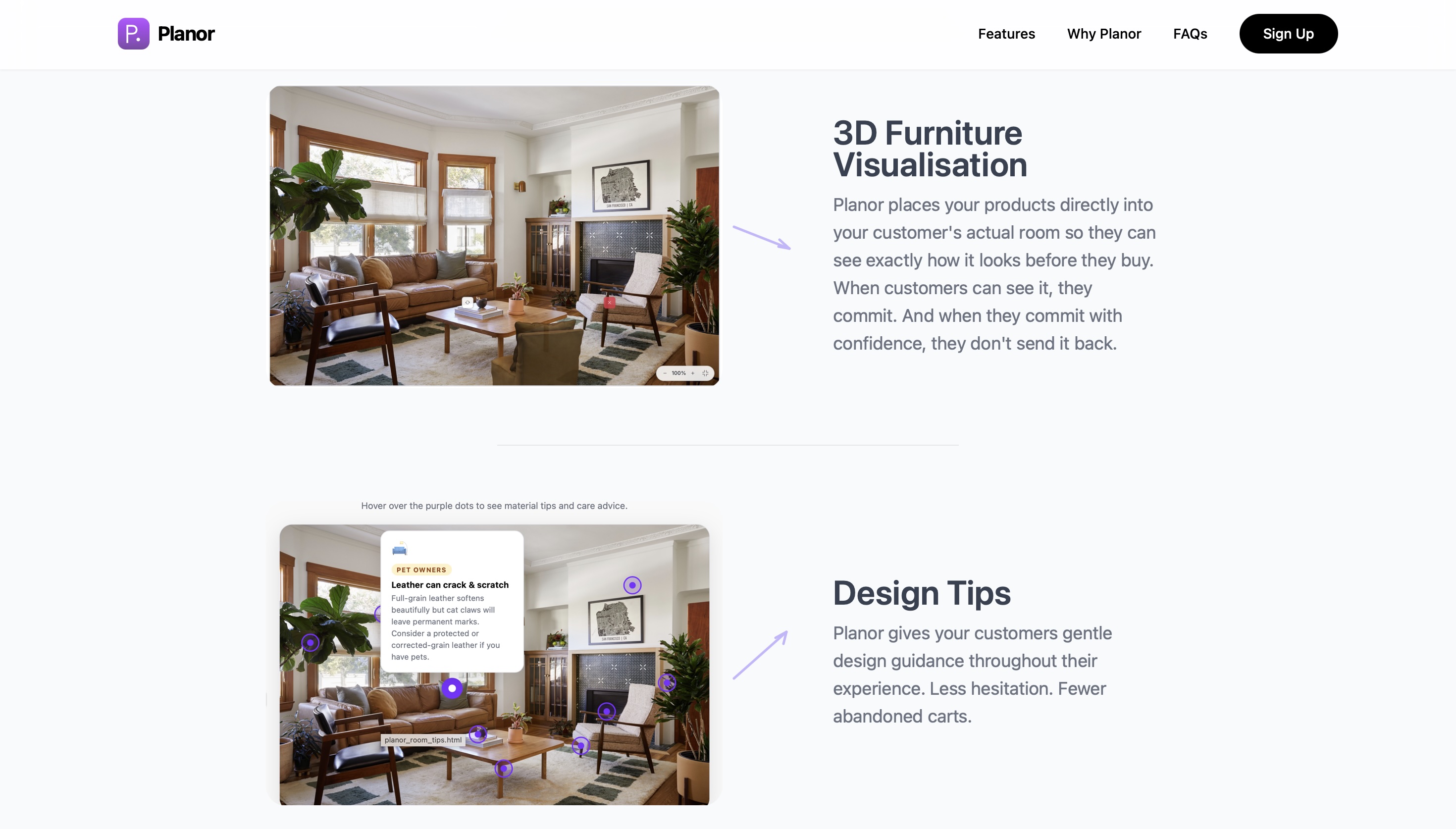
The design tips feature - contextual material and care advice surfaced as hover hotspots directly on the room photo. Each tip is anchored to the object it refers to: a leather sofa triggers a pet-scratch warning, a rug near a fireplace triggers a safety notice. Tips appear on hover, not in a separate panel, so they feel like guidance rather than interruption.
Pilot data from the first two Australian retailers will be published after the initial 30-day cohort.
Founder bias is a real design risk.
When you build the product, you already know how it works. That familiarity makes it easy to skip steps that confuse first-time users. The pilot reminded me that what feels intuitive to the person who designed it is not always intuitive to the person using it for the first time.
Five steps is already a lot to ask.
The flow works. But every additional step between a shopper and checkout is a potential exit point. Version two will look at compressing the onboarding survey and room upload into a single entry moment rather than two sequential screens.